
USim: a Remote Learning App
USim is our final project for the User Experience course. It is an exercise on the methods of developing user experience including mapping the experience, analyzing the user information, utilizing that information into the design, and testing and evaluating the solutions.
USim is a learning application platform designed for the remote implementation of future User Experience courses.
User Survey: The first step was to conduct a survey in order to determine our user profile. We asked about gender, age, mobile OS, most used app, and questions related to learning app use. We received 12 responses which we used to summarize our user profile.
User Profile: Our user is on average 24 years old with intermediate tech savvy who mainly uses Android but could also be an iOS user. The most used apps are Youtube, Instagram and Facebook. To support their learning, they have used/are using learning apps, mostly at home, for an average usage time of 20-30 mins.
User Study: To understand our user needs deeper, we conducted a semi-structured interview to potential users. The questionnaire was formulated based on three parts: general experience with Moodle (which the UX course is currently hosted), their experience with other learning apps, and their needs and expectations. the interviews lasted for about 10-20mins.
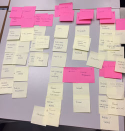
Requirement Analysis: The interviews were transcribed and after which they were coded. The coded transcripts were analyzed for the requirements and where further analyzed into Affinity Diagrams. The team then did a brainstorming and ideation workshop and voted on priority themes and requirements:
Format and Contents: Video contents, Discussion Board, Quizzes and Games, Feedback
Interface: Customizable, Helpful icons, Ease of Use
Layout: Side Menu and Navigation
Scenario: Two scenarios were made, one for at-home (desktop) and one for on-the-go (mobile). The scenarios were then reviewed with users for feedback.
Desktop - Tommi Savolainen is a Haaga-Helia student enrolled in the User Experience course. He has a part time job and prefers to study at home.
He opens his computer and logs into the system. The platform shows his customized view of the schedule and course content. He wants to study the contents of week 1 and clicks on the mentioned week icon on the sidebar. The content is displayed on the body of the page and he chooses to watch a video. The platform runs smoothly and Tommi successfully accessed the content. He is prompted to take a short quiz to reinforce the concepts he learned from the materials. He takes the quiz, sees his progress and is ready for the next lesson.
Mobile - Tommi is on his way to work. He took a train to his part time job and the journey duration is around 30 minutes. He receives a notification that someone responded to a question he posted on the course discussion board. He taps the notification icon, and a preview of the answer is displayed. Tapping the preview directs him to the discussion board, where he is able to read the teacher´s response to his question. Tommi reads the message and gets the clarification he needs. While on the platform, he also reviews the deadlines and assignments for the User Experience course. Tommi can plan his coursework even while on the go.
Prototyping: Based on the requirements and the scenarios, we designed paper prototypes of the app. Marvel versions of the prototype were also done for the user test.
User Testing: The prototype was subjected to user testing on its usability and interface. Users tested the app on heuristics based on Nielsen's 10 Usability Heuristics for User Interface Design. The test users were also asked for additional comments and feedback.
The results were analyzed and the evaluation could be used to further improve the design.
 |  |  |  |  |
|---|---|---|---|---|
 |